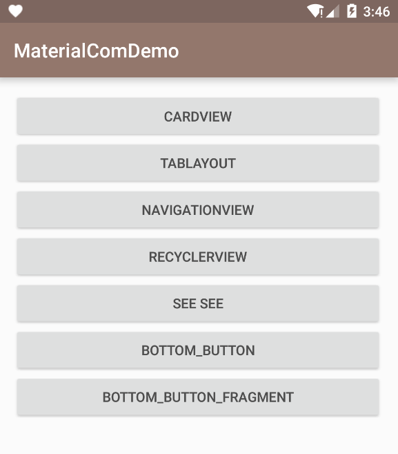
android - material design 控件
包括cardView, tabLayout, navigationView, recyclerView, inputLayout, dialogFragment, bottomBar.
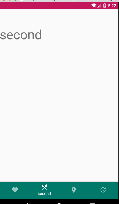
Bottom navigation
demo
单纯底部的导航条。
How to build android material design bottom navigation (part 1)
We need to add Material Design Support Library and Bottom Navigation library so we can ust it, so open build.gradle file and add the following code:
1 | dependencies { |
- com.sally.servicedemo.design/ FiveButtonsActivity.class, five_buttons_activity.mxl, res/menu/five_buttons_menu.mxl, res/values/colors.xml
we can customize the bottomBar icons color, theme, fonts and so on. through this method:
1 | // set the color for the active tab. |
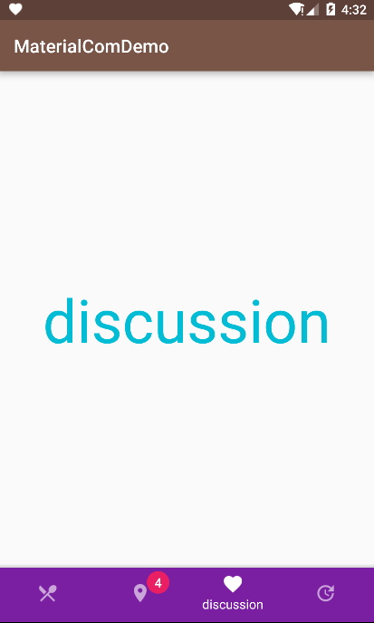
demo2
Bottom Navigation控制Fragment。
How to build android material design bottom navigation (part 2)
Buttons
Flat buttons:0dp
Raised buttons:2dp
Floating action button
Persistent footer buttons
Dropdown buttons : generic overflow dropdown button, segmented dropdown button, editable segmented dropdown button
Toggle buttons
usage
Useflat buttonsin dialogs;
Useraised buttonsor flat buttons (depending on your layout) for inline buttons;
If your app requires actions to be persistent and readily available to the user, consider using thefloating action buttonorpersistent footer buttons.
component & 源码
包括cardView, tabLayout, navigationView, recyclerView, inputLayout, dialogFragment, bottomBar.
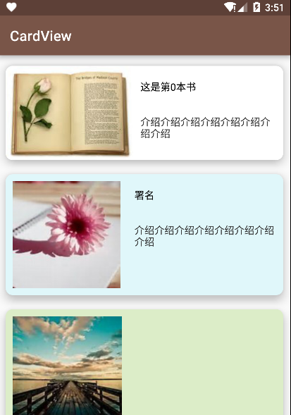
cardView
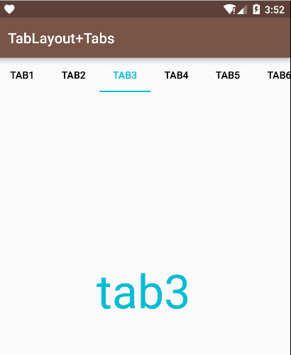
tabLayout
viewPager.setAdapter(adapeter);
tabLayout.setTabMode(TabLayout.MODE_FIXED | TabLayout.MODE_SCROLLABLE); // 导航条是否可以滚动
tabLayout.setupWithViewPager(mViewPager); // tabLayout与viewPager关联
tabLayout.setTabsFromPagerAdapter(adapter); // tabLayout设置adapter,与viewPager是同一个适配器,适配去需要重写getPageTitle()方法,不然导航条没标题😂
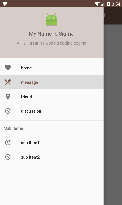
- navigationView
1 | <android.support.design.widget.Navigation |
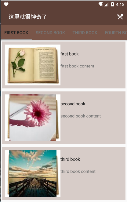
- recyclerView
这里就很神奇了这个部分AppBarLayout可以跟随RecyclerView的滑动显示或隐藏,但是根布局需要使用android.support.design.widget.CoordinatorLayout
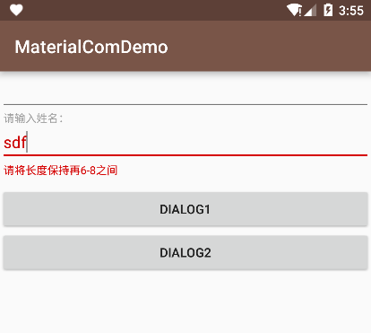
- textInputLayout & dialogFragment
提示效果美美哒输入框1
2
3
4
5
6
7
8
9
10
11
12
13
14
15
16
17
18
19
20
21
22
23mTextInputLayout.setHint("hint ..... ");
// 可以获得其内部的edittext
mEditText = mTextInputLayout.getEditText();
// 添加监听事件
mEditText.addTextChangedListener(new TextWatcher() {
@Override
public void beforeTextChanged(CharSequence s, int start, int count, int after) {
}
@Override
public void onTextChanged(CharSequence s, int start, int before, int count) {
if(s.length() > 8 || s.length() < 6) {
mTextInputLayout.setErrorEnabled(true);
mTextInputLayout.setError("请将长度保持再6-8之间");
} else {
mTextInputLayout.setErrorEnabled(false);
}
}
@Override
public void afterTextChanged(Editable s) {
}
});
可以通过继承DialogFragment创建对话框,很简单,加载一个布局就行了1
2
3
4
5
6
7
8
9public class DialogFragment1 extends DialogFragment {
@Nullable
@Override
public View onCreateView(LayoutInflater inflater, ViewGroup container, Bundle savedInstanceState) {
View view = inflater.inflate(R.layout.dialog_fragment1, container, false);
return view;
}
}
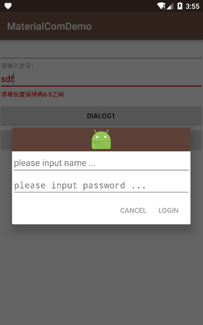
也可以定制能交互的dialog1
2
3
4
5
6
7
8
9
10
11
12
13
14
15
16
17
18
19
20
21
22
23
24
25
26// 重写onCreawteDialog方法,使用AlertDialog.builder生产并返回一个Dialog
@NonNull
@Override
public Dialog onCreateDialog(Bundle savedInstanceState) {
final View view = getActivity().getLayoutInflater().inflate(R.layout.dialog_fragment2, null);
mEtName = (EditText) view.findViewById(R.id.id_dialog_et_name);
mEtPassword = (EditText) view.findViewById(R.id.id_dialog_et_password);
AlertDialog.Builder builder = new AlertDialog.Builder(getActivity());
builder.setView(view)
.setNegativeButton("CANCEL", null)
.setPositiveButton("LOGIN", new DialogInterface.OnClickListener() {
@Override
public void onClick(DialogInterface dialog, int which) {
// 回调宿主activity的响应操作
LoginListener listener = (LoginListener) getActivity();
listener.onLoginInputCompare(mEtName.getText().toString(), mEtPassword.getText().toString());
}
});
return builder.create();
}
// 暴露一个接口给activity实现
public interface LoginListener {
void onLoginInputCompare(String userName, String password);
}